
It was made by Goldman Sachs, and I found it in a website for economic data.
I think this map is very interesting because it shows the disparity between developed nations and developing nations, and how wealth is concentrated in only some areas, even inside of developed nations (looking at the Midwest part of the US map, we can see it is very poor, but the coasts are very rich) and in developing nations (like in Brasil, there is wealth in the São Paulo area, but in the interior and to the north there is not much wealth concentration).
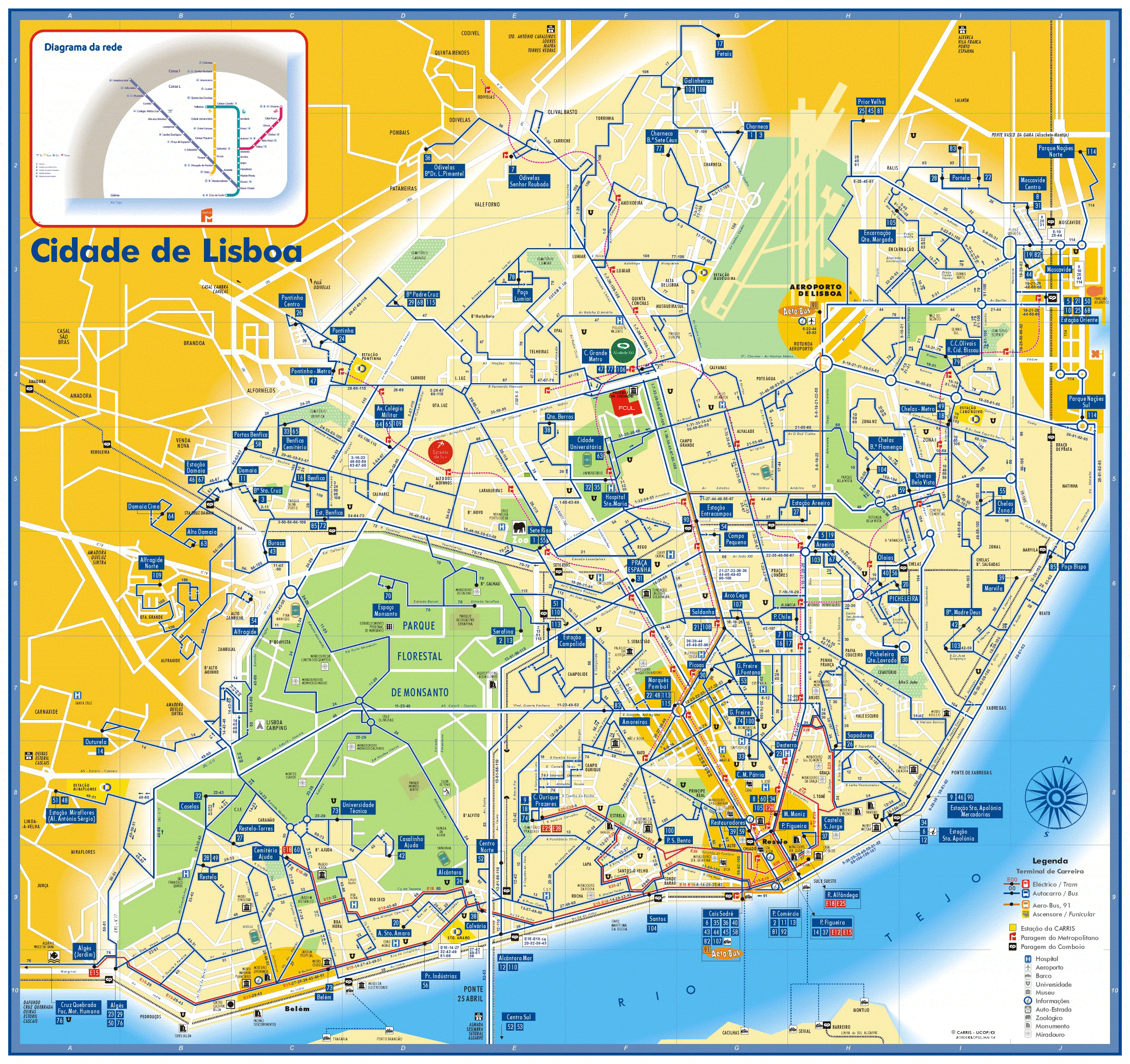
This is a very detailed map of public transportation in my home town, in Lisbon, Portugal. It indicates the bus routes, the metro stops, train stops and even hospitals, monuments and beaches. It is very straight lines map, and in reality it isn't so straight, so this map was made more to illustrate the transportation and the routes than actually serve as a super accurate map.
It was made by Carris, the public enterprise responsible for developing and maintaining bus and metro transportation in Portugal.
I like this map because when I looked at it, immediately I thought of the routes I use to take to school and it reminds me of my house and the areas I hang out at all the time when I am there. It also really makes me miss good public transportation, because public transportation here in LA is really really bad, and in Portugal it is cheap and very good (it used to be cheaper still).

This is a map of surfing spots in Rio de Janeiro, in Brasil. It is very small, but it serves a specific purpose. Also it shows the scale and the other 2 did not. It also shows the cities nearby and also the airport. It looks like it also shows topography, by the colors on the map.
It was developed by the website wannasurf.com, a website that is designed to inform surfers of the surf spots, the weather, the swell and so on. So it is very targeted to a limited group of people.
I like this map because I want to go to Rio and when I go there I want to surf also, I hear the water is really warm. Surfing in warm water is really fun. But the beaches there are very crowded and locals there are very rough I have also been hearing, so maybe I should try to look in other areas of Brasil, like maybe the north, which is really beautiful and the girls are gorgeous and the waves are great too.
Here is the link for the maps:
http://www.econbrowser.com/archives/2007/01/sachs.png
http://mappery.com/maps/Lisbon-Bus-Tram-and-Metro-Map.gif
http://www.wannasurf.com/spot/South_America/Brazil/Rio_de_Janeiro_City/map/map_-surf-spots-brazil-rio.gif